
Complementary colors
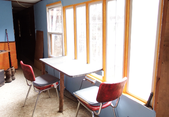
The
consensus seemed to be
to play it safe by carrying over the light blue from the facing wall.
And I mostly stuck with that...but I couldn't quite resist adding some
orange on the wood around the window frames.
And now I've finally run
through my $200 stash of painting supplies. In case anyone's curious,
the three walls I played with this winter required four gallons of
joint compound (for texture), a gallon of primer, a gallon of white
(for mixing), most of a gallon of blue, and parts of two pints of
orange and yellow-orange. Not so bad for sprucing up about a third of
our trailer in one fell swoop.

Or explore more posts by date or by subject.
About us: Anna Hess and Mark Hamilton spent over a decade living self-sufficiently in the mountains of Virginia before moving north to start over from scratch in the foothills of Ohio. They've experimented with permaculture, no-till gardening, trailersteading, home-based microbusinesses and much more, writing about their adventures in both blogs and books.
Want to be notified when new comments are posted on this page? Click on the RSS button after you add a comment to subscribe to the comment feed, or simply check the box beside "email replies to me" while writing your comment.
RSS
comment 1
This looks so good! You should think about being an interior decorator as a hobby.
Comment by
Kayla
— Wed Dec 14 10:53:00 2016
- Remove comment
Wall painting
I'm curious to know why you used joint compound instead of just buying textured paint (or is that not available anymore?) When I did some renovation on my bedroom where I took out the north window and replaced it with sliding glass doors on the west side of the house, I covered up the mismatched wall with textured paint and then bought what I thought at the time was a kind of beige/cream paint that turned out to be more pinkish. (I HATE pink! Reminds me of Pepto Bismol). Since then I discovered the color was something called "Venetian plaster". It looks fine on the textured wall. The other three walls were left alone. I'm now considering painting the other three walls a greyed green to match the drapes I have over the sliding glass door, which now goes out onto my back deck.
Comment by
Nayan
— Wed Dec 14 10:55:45 2016
- Remove comment
Complementary Colors
And compliments to the painter/artist - nice touch on the windows!
Comment by
Jayne Wead
— Wed Dec 14 11:08:01 2016
- Remove comment
Painting
You need a like button!!!
Comment by
Donna Stroud
— Wed Dec 14 11:34:59 2016
- Remove comment
light
So bright and inviting - particularly during such a dark part of the year.
Comment by
Charity
— Wed Dec 14 11:47:00 2016
- Remove comment
comment 6
I like the blue with orange trim. Looks nice. We too are slowly fixing up our doublewide and just put "real" flooring in our bedroom after 7 years! It's the little things that make us happy isn't it.
Comment by
Pam Kaufman
— Wed Dec 14 12:07:11 2016
- Remove comment
Add a comment