
MyPlate: The new government "food pyramid"
 The
USDA rolled out a new visualization of their
dietary recommendations last week. After the
previous diagram (which was so painfully
difficult to get information from that I gave up on it), I was thrilled
to see that the USDA now uses the same method I do when planning dinner
--- divide the plate up into quadrants and show how much space you
should devote to each food group. (This plan is much easier to
follow at home if you plate everybody's food rather than putting bowls
on the table buffet style.)
The
USDA rolled out a new visualization of their
dietary recommendations last week. After the
previous diagram (which was so painfully
difficult to get information from that I gave up on it), I was thrilled
to see that the USDA now uses the same method I do when planning dinner
--- divide the plate up into quadrants and show how much space you
should devote to each food group. (This plan is much easier to
follow at home if you plate everybody's food rather than putting bowls
on the table buffet style.)
I'm also pleased to see
fruits and vegetables taking up a full half of the plate. I try
to make fruits and vegetables fill more like two thirds or three
quarters of our plates once you factor in dessert (strawberries and a
bit of chocolate on the side for the lunch pictured here), but I can
see how the government might 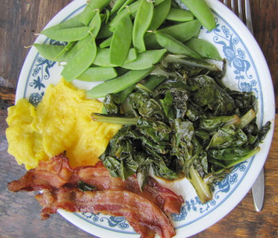 be scared to increase the
proportions so drastically from their 1980s era recommendation of 34%
of your servings being fruits and vegetables. Granted, since
serving sizes varied for each type of food in the old pyramid, the USDA
might have meant us to fill half of our plates with fruits and
vegetables all along, but I don't think that's the gist folks got from
the old diagram.
be scared to increase the
proportions so drastically from their 1980s era recommendation of 34%
of your servings being fruits and vegetables. Granted, since
serving sizes varied for each type of food in the old pyramid, the USDA
might have meant us to fill half of our plates with fruits and
vegetables all along, but I don't think that's the gist folks got from
the old diagram.
However, I have several
gripes with even this improved government recommendation:
- Why "grains" instead of "carbs"?
I know that it would take a bit more education to help people
understand what a carbohydrate-rich food is, but I think the MyPlate
chart is going to confuse a lot of people who might throw potatoes and
winter squash into the vegetable category. (I'll bet the corn
industry has a lot more lobbying power than the potato industry.)
And these confused eaters will just pretend their dessert didn't happen
since they won't know where to fit it on the plate, when they should
really be counting it into the carb category in most cases.
- Where are the fats and oils?
Most people aren't going to categorize nuts, homemade chicken broth,
and olive oil as "protein", so where will they put these fatty foods on
their virtual plate? The government website says an almond fits
in their protein group, but the percent of total calories made up by
protein in an almond is only 15%, while fat provides a whopping 70% of
the nut's energy.
- Why is dairy so special?
The more I delve into nutrition, the more I think that it's a bit odd
to make dairy its own category. (Or perhaps the milk industry is
just so powerful that they can tell Americans to drink our milk with
every meal regardless?) In fact, it makes me wonder if this isn't
the government's "fat" category, but even that is confusing since many
people drink skim milk or eat low-fat yogurt. (No, dairy is not
the only way to get calcium --- a cup of cooked greens will provide a
quarter to a half of your daily allowance, depending on variety, and
most vegetables have an appreciable amount of calcium.)
 Although
it's easy to argue that government nutritional guidelines mean
nothing, I know that I learned the old food pyramd in school and strove
to incorporate the recommendations into my life. I think that
many people, like me, blindly follow the advice given by authority
figures, so it's important for those authority figures to get it right.
Although
it's easy to argue that government nutritional guidelines mean
nothing, I know that I learned the old food pyramd in school and strove
to incorporate the recommendations into my life. I think that
many people, like me, blindly follow the advice given by authority
figures, so it's important for those authority figures to get it right.
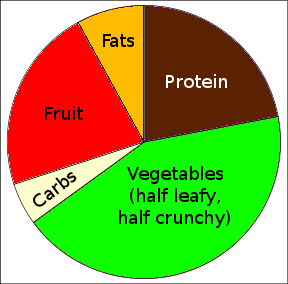
If I was in charge of
the USDA, I think my food plate would look more like the hastily thrown
together pie chart shown here. What would your ideal plate look
like?
Or explore more posts by date or by subject.
About us: Anna Hess and Mark Hamilton spent over a decade living self-sufficiently in the mountains of Virginia before moving north to start over from scratch in the foothills of Ohio. They've experimented with permaculture, no-till gardening, trailersteading, home-based microbusinesses and much more, writing about their adventures in both blogs and books.
Want to be notified when new comments are posted on this page? Click on the RSS button after you add a comment to subscribe to the comment feed, or simply check the box beside "email replies to me" while writing your comment.
My pet peeve with charts like these is how vague they are. To my engineering trained eye, nutrition is sometimes more akin to voodoo than science. These charts are extremely unspecific. Any engineering student who would submit a graph like this would probably receive an F for their troubles! Is the fraction by weight or by volume? Are we talking dry weight or not? The latter is pretty important since our food is probably mostly water (by weight). Also, which kind of lifestyle and age is this chart meant for? Someone who does a lot of physical labor or a pregnant woman has other needs that a desk-jockey. And a growing child has other needs than a pensioner.
Charts like these are usually made for an "average" person. The difficulty with averages is that they often don't exist.
Nutrition is only one factor in staying healthy. Exercise, environmental factors and usage of recreational chemicals are also important, even though I'll admit I wouldn't be able to affix a relative importance to them, outside of the obvious extremes.
Well, the point is simplicity, so you have to get vague. The authors (very rightly, I think) assumed that the average American isn't going to spend more than five minutes getting the gist of the chart, so they chose just a few key points to get across. You have to understand that this isn't a graph, but a visualization of a concept.
Two incarnations ago, the visualization was more scientific, and broke each category down by servings. The problem there was that each type of food had a different serving size, so the average person would have had to spend half an hour crunching numbers to see if their lunch fit the requirements. There's no way anyone except the most obsessive was going to do that.
I think it's actually quite clear from the plate graphic that they're not talking about weight but volume. Since everyone's plate can be a different size, that gets around the problem of making one recommendation that fits the couch potato as well as the construction worker --- the couch potato can eat off a five inch plate and the construction worker off a ten inch plate, but each can set up their plate the same way. (This is actually how I plan Mark's and my meals --- he gets a bigger plate than me since he tends to do heavier work and is also considerably bigger, but the proportions are about the same on each plate.)
While I agree with all of your observations about the flaws regarding the plate, I think there are some assumptions going on on behalf of the USDA. This plate is not meant for individuals like you and I who know better, it's meant for the unhealthy, overweight population at large who will dump fats and oils on everything without being prompted. if you tell them fill 3/4 of your plate with plant materials, they will undoubtedly use fats and oils to attempt making them tastier. Why, then, add in a category that will only inflate eaters following the guide to add in more? As for dairy, I don't believe the dairy category is meant to serve as a drink glass. If you notice, the circle overlaps the edge of the plate, as if to say: oh, and some dairy too. Not that we should drink our meals with milk at every meal.
I agree that there is a lot to complain about, but as I mentioned before, the fact that they are attempting to impress the image of 3/4 of a plate filled with vegetation is a vast improvement over anything that's come previously. As another commenter said, it's simplified for simple results. Hopefully future incarnations of the plate will become more and more refined to be both straight-forward and cohesive.
You've got a good point that fats and oils tend to be ingredients in other dishes rather than a lump on your plate. I'm on the fence, though, about whether the government nutritional guidelines should set the bar lower so that more people can jump through the hoop, or whether it should be a realistic analysis of what we should actually be eating. On the one hand, I can see your point --- if they put out a food plate like the one I mocked up, I think 85% of Americans wouldn't even bother trying to get there. But on the other hand, by setting the bar too low, we end up with a lot of people who think they are eating right but who actually aren't. I'm still pondering this fine line....
I think the milk category is just plain confusing. Reading their website, they clearly meant it the way I took it --- have a glass of milk or small serving of cheese, yogurt, etc. with each meal. However, putting the glass of milk outside the plate makes it hard to tell how big that serving is compared to the servings of other types of food. (But, to play devil's advocate, I'm not sure that a plate diagram with five slices instead of four would be as easy to take in at a quick glance, which is definitely a laudable goal.)
I agree with your assertion that fats need to be included in the new food pyramid. Contrary to the nutritional advice of most of my lifetime, most fats aren't inherently unhealthy. Even some saturated fat is necessary in a healthy, balanced diet. The only fat that is never good for you is trans-fat.
However, I'm not quite sure what you have so against dairy. Sure there is a lot of saturated fat involved (while most milk drank these days is low- or non-fat, I think most people get their dairy from cheese and very infrequently the part-skim kinds) and doesn't contain any nutrients that can't be consumed elsewhere. But that doesn't mean that it doesn't have it's place. Besides, which do think you will have a better chance getting a child to eat, kale or milk?
I know you aren't a big fan of grains; I've read your lunchtime series on early agriculture. But I'm not sure that the argument that early agricultural man was less healthy the hunter-gather man holds up against Jared Diamond's assertion that this was due to the fact that food supply couldn't keep up with the population explosion afforded by the "sedentary" lifestyle of farmers.
As far as whether or not this new chart provides enough information; it is certainly a vast improvement over the previous chart which provided NO information besides a link to a website. I remember when that one came out and laughing at it. And the big thing to remember, this is more than just an isolated update of USDA policy, it's one prong of a multi-front attack on childhood obesity by Michelle Obama. This food pyramid isn't about adults who can sit and make informed decisions about their diet. It's designed to be kid friendly to get the kids into the mindset of eating healthy.
I should have been clearer --- I'm not opposed to dairy. I just don't understand why it merits its own nutritional category when, say, nuts or fish don't get their own. Depending on what kind of dairy you're consuming, I'd either put it in the protein group or the fat group, so I think you should just go ahead and expand those groups a bit and delete the dairy group. By putting dairy in its own group, you're sending the message "dairy has nutrients you can't get in any of the other groups", which I see as the result of dairy industry lobbying for preferential treatment.
I think you made an excellent point by saying that this is aimed at kids. And I think you're totally right that it has to be kept simple to be kid-friendly, and that kids are going to be the main people who take in this message (since it will presumably be taught in school like the old ones were.) But that makes it even more essential to make the main points right since these kids may never think past this basic understanding even when they turn into adults! Having met kids who would rather have real carrots than cake for dessert, I think our generalizations about what kids will and won't eat are somewhat self-fulfilling prophecies....
The gov't subsidizes the wheat, corn, soy growers, so the gov't pushes people to eat these products. They are in many food products, even some ketchup and ice cream products, a cheap filler. 'Vegetable oil' is 100% soy (if you get breast cancer you will be told not to eat any soy - and it's added to a lot of foods). The book 'Wheat Belly' by cardiologist Dr. Wm Davis attributes many health problems with the 'new wheat' - it's not the same wheat we ate 40 and 50 yrs ago (it's a hybrid - not even close!). My daughter had digestion problems; we stopped eating wheat and she was better within a few weeks. She also lost 8 lbs. the first month. I went from 164 lbs. to 132 within 18 mos. - and now I eat anything I want and my weight barely varies. 'Dangerous Grains' by J. Braly, MD and Ron Hoggan, MA also eye-opening.